Daredevil
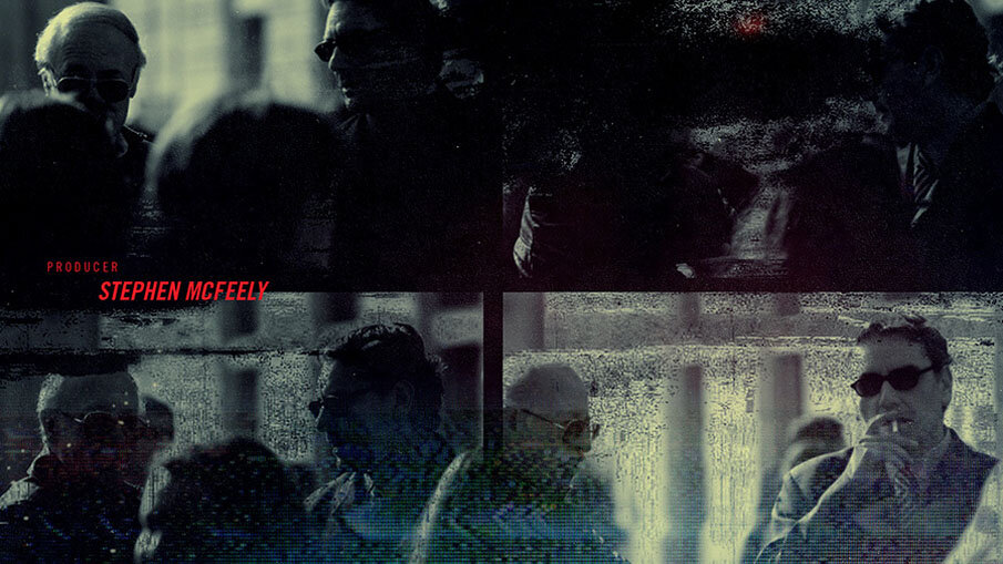
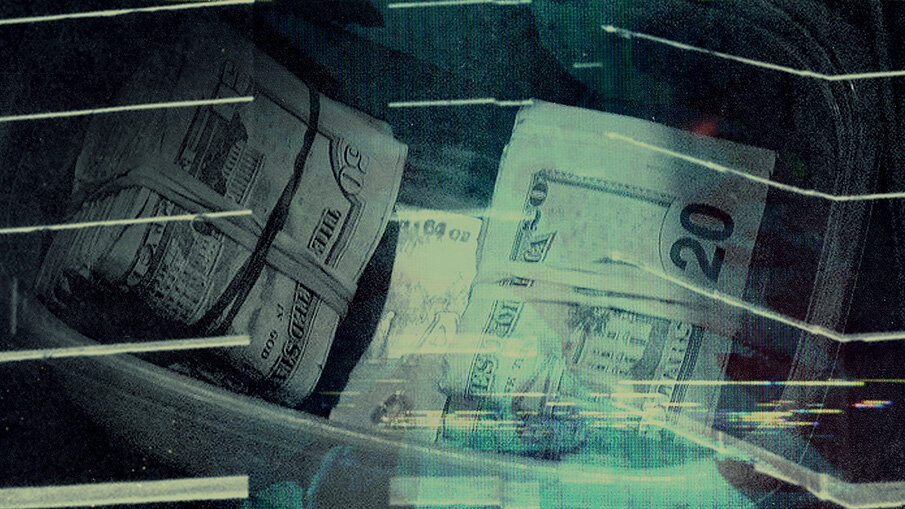
For Netflix's Daredevil, the title sequence was designed to mirror the show's darker, more grounded approach to the Marvel Universe. Taking inspiration from Matt Murdock's dual identity and the haunting moral complexity of Hell's Kitchen, we built a visual language that felt tactile and raw. Red, wax-like fluid slowly reveals key icons of the city, from Lady Justice to water towers, creating a sense of corruption seeping into every crevice of the world.
By grounding the sequence in noir-inspired minimalism and invoking the idea of justice obscured, the design helped position Daredevil as a gritty, character-first departure from the high-gloss superhero genre. The end result was a brooding, visceral identity that set the tone for one of Marvel's most critically acclaimed streaming entries.
—
Role: Designer + Art Director
Client: Netflix


